Building a content strategy

for H-E-B's smallest (and most valuable) piece of real estate

for H-E-B's smallest (and most valuable) piece of real estate

for H-E-B's smallest (and most valuable) piece of real estate

Before

After

We redesigned the legacy product card to be mobile-first, have a stronger hierarchy, and provide future flexibility

Key contributions

Scalable content architecture

Scalable content architecture

Made complex content hierarchy choices with limited real estate by defining the relationship between the product card and product detail page

Made complex content hierarchy choices with limited real estate by defining the relationship between the product card and product detail page

Component governance systems

Component governance systems

Created and documented a scalable system for an ever-changing feature to accommodate future additions and design extensions of the product card

Created and documented a scalable system for an ever-changing feature to accommodate future additions and design extensions of the product card

Cross-functional stakeholder alignment

Cross-functional stakeholder alignment

Secured buy-in from multiple stakeholders with competing needs through strategic positioning and collaborative work sessions

Secured buy-in from multiple stakeholders with competing needs through strategic positioning and collaborative work sessions

Project details

Role

Lead UX content designer

Team

Product design, search engineering, merchandising, product management

Responsibilities

Content hierarchy, stakeholder alignment, microcopy, governance framework

Opportunity

The H-E-B product card needed a refresh due to:

  • Lack of real estate: no room to add new features like low stock alerts and dietary/allergen highlights

  • No clear content hierarchy: design elements were not organized for importance or scannability

  • Inconsistent design elements: Information types were presented in several conflicting styles

  • Outdated mobile approach: we were still using a two-column design on mobile sizes and wanted to move towards a single-column design

Goals

For our customers:

  • Speed up decision-making

  • Simplify the content hierarchy to reduce mental load

Internally:

  • Allow for feature growth and flexibility

  • Improve delivery time for future product card enhancements

My approach

1

Pull from research insights

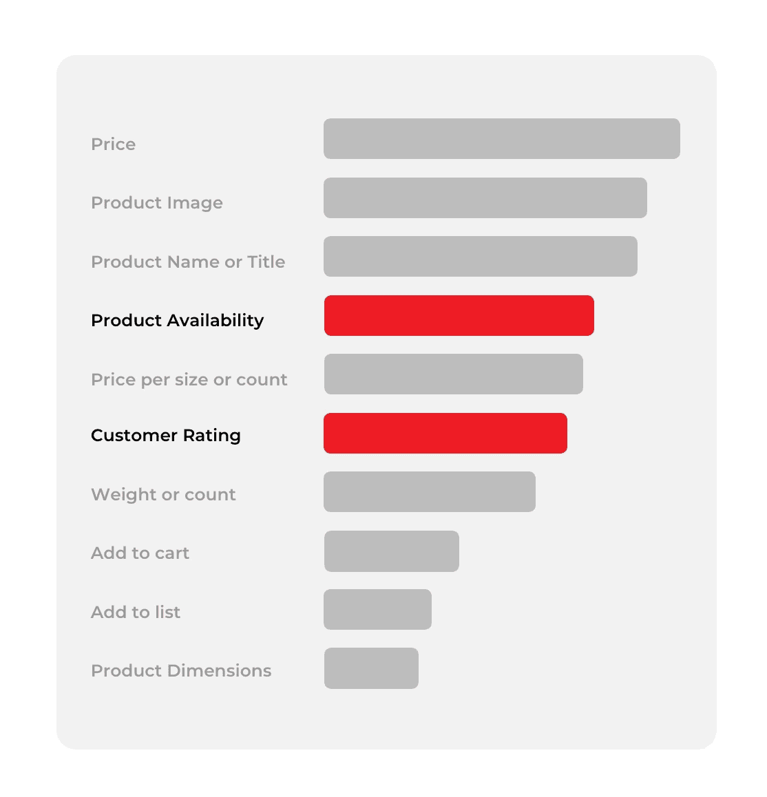
The team had previously conducted user research to identify key pieces of information that customers prioritized looking for on the product card: visibility and clarity of price, image, and name. We also wanted to increase visibility of product availability, another priority for our customers.
Product card zones
Product card zones

2

Create an information hierarchy

Before establishing visual design, I ensured full team alignment on the information hierarchy for current product card content, which included:

  1. Auditing/documenting existing product details

  2. Meeting with stakeholders to identify future content needs to accommodate for scalability

  3. Card-sorting to group like information

  4. Defining “zones” to align with customer intent models as defined by earlier research

Product card zones
Product card zones

3

Craft product card tenets

As an ever-changing entity, the product card needed documented tenets to guide current and future decisions on what information to accommodate. These tenets serve as an evaluation tool for stakeholder requests across the business, establishing rules to point to when we need to push back.

4

Design

Because we took the time to establish a component information architecture, ideation was efficient and painless.

  • We converted the outdated and disparate UI elements into new ones that reflected the groupings we'd defined in the content hierarchy exercise.

  • I built out a robust document that catalogued the rules and hierarchy of each product card element.

Because we took the time to establish a component information architecture, ideation was efficient and painless.

  • We converted the outdated and disparate UI elements into new ones that reflected the groupings we'd defined in the content hierarchy exercise.

  • I built out a robust document that catalogued the rules and hierarchy of each product card element.

Content decisions

Product title length

Product title length

To determine product title length and truncation rules, I pulled our longest product titles to test against. I knew users could always click through to the PDP to get the full title, but I still wanted to ensure enough of the name was visible in most cases. Three lines before truncation allows our users to see nearly every full product name without needing to scroll.

To determine product title length and truncation rules, I pulled our longest product titles to test against. I knew users could always click through to the PDP to get the full title, but I still wanted to ensure enough of the name was visible in most cases. Three lines before truncation allows our users to see nearly every full product name without needing to scroll.

Terminology

Terminology

My rule of thumb here was "if it ain't broke, don't fix it." We already had well-established ways of talking about items on promotion and I didn't want to confuse users by introducing anything new. We kept the wording on promotional labels the same, save for striking the "On" from "On sale." Every character counts!

My rule of thumb here was "if it ain't broke, don't fix it." We already had well-established ways of talking about items on promotion and I didn't want to confuse users by introducing anything new. We kept the wording on promotional labels the same, save for striking the "On" from "On sale." Every character counts!

Product size

Product size

In the previous product card design, product size was shown appended to the product name separated by a comma. We felt pressured to keep the current data mapping, which sent product title and size as a single piece of data to the front end, so I didn't push to change the way product size is shown. I wish I had. The size isn't always truncated, but enough that it bugs me every time I see it.

In the previous product card design, product size was shown appended to the product name separated by a comma. We felt pressured to keep the current data mapping, which sent product title and size as a single piece of data to the front end, so I didn't push to change the way product size is shown. I wish I had. The size isn't always truncated, but enough that it bugs me every time I see it.

Results, impact & learnings

3%

3%

Add to cart rate from product card

6%

6%

Engagement with product card

22%

22%

Click to product detail page (suggesting users were getting the info they needed directly from the product card)
If you build it (a framework), they will come.

The product card framework is one of the most referenced strategy documents across our design org. It's been leveraged to re-design the product detail page, the coupon detail card, and more.

Scalability that worked.

Since launching the new product card, we've seamlessly added two new pieces of information to the hierarchy because we'd planned for it: labels indicating SNAP eligibility and availability information. What could have been a quarter's worth of work was accomplished in a couple sprints.

Sometimes, one size doesn't fit all.

Because the product card is used in so many different spaces and within several different types of components, we find ourselves having to make decisions per specific context, rather than having one set of information that works everywhere. It can make assessing new information difficult.