Reimagining the homepage


Key contributions
Project details
Role
Lead UX content designer
Team
Product design, customer experience engineering, merchandising, marketing, product management
Responsibilities
Content architecture, content modeling for the CMS, stakeholder alignment, guidelines creation
Opportunity
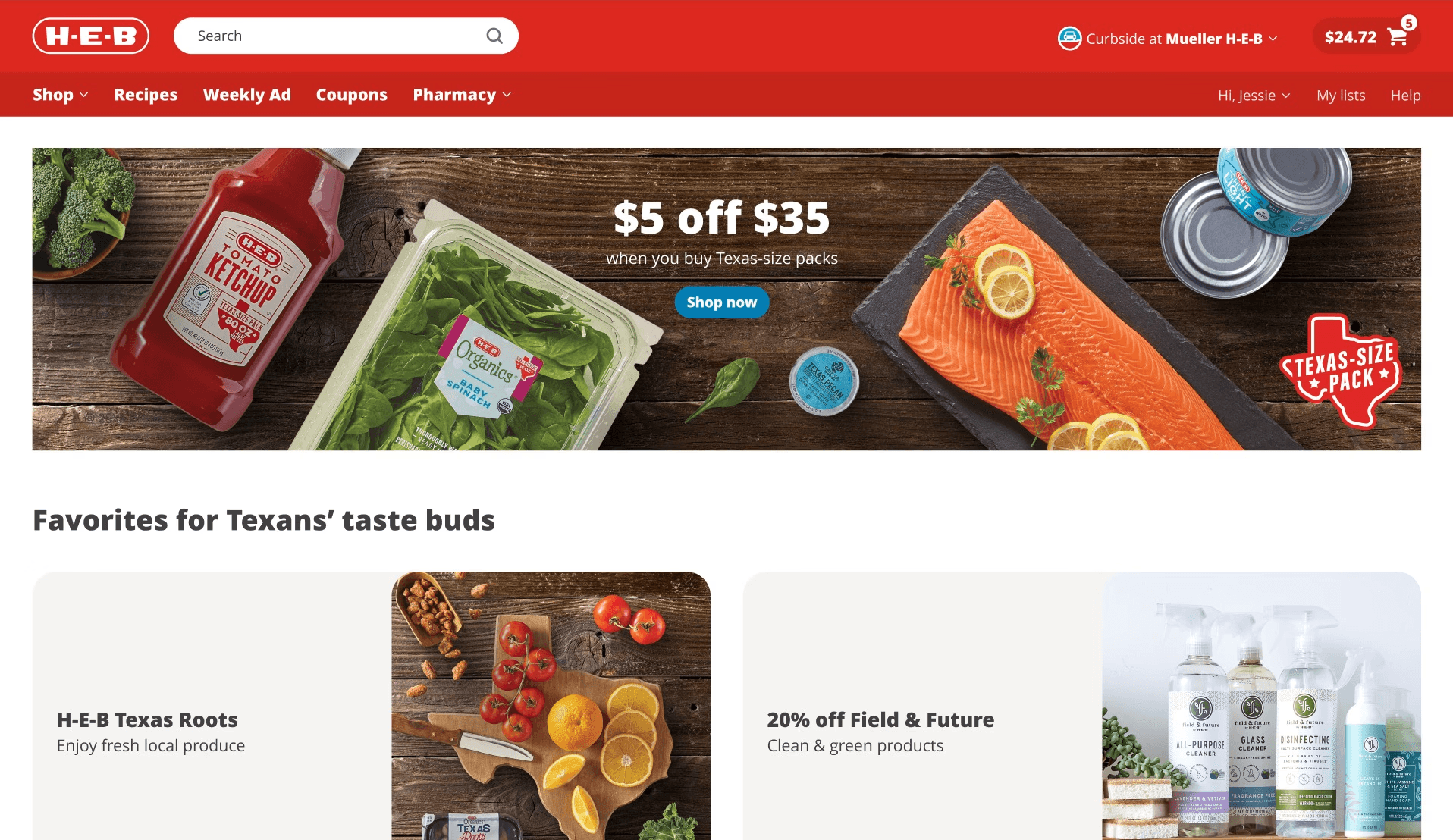
H-E-B's marketing and merchandising teams were looking for new, more compelling ways to merchandise the homepage experience. They wanted more content above the fold and multiple layouts to choose from depending on what initiatives needed support that week.
Goals
For our customers:
Encourage product discovery
Improve possibility of relevancy for content users see above the fold
Manage cognitive load to minimize negative impacts on customer experience
Internally:
Maximize revenue (add to cart rate from homepage)
Create more paid placement opportunities
Increase engagement with marketing campaigns while not cannibalizing from merchandising objectives
My approach
1
Turning qualitative research & competitive analysis into actionable insights
Our Design Research team led a series of customer interviews to establish a baseline of what users like to see on retail homepages, their sentiment towards ads, and personalized content. They also conducted a competitive analysis of other retailers' homepage experiences.
Meanwhile, our team began discussion with the team members who create and publish marketing and merchandising content to understand their goals and pain points.
Out of these discussions, we identified some driving insights:
Both users and content publishers wanted the opportunity to add to cart right away via product carousels and not have to click out to other pages to add products to cart
Users were very used to see ads in their ecommerce experiences and were not turned off by the idea of having sponsored items high on the page
Many other retailers had incorporated some sort of tiled layout into their digital experiences, which provided lots of flexible slots for featuring varied content
2
Collaborating with product design as they develop template ideas
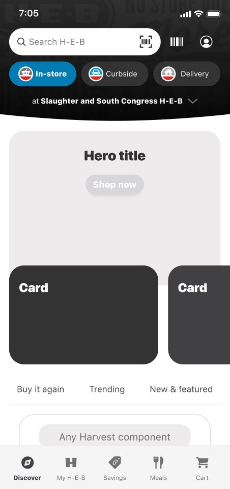
I worked closely with two product designers as they worked through different template options to ensure copy was being considered as every decision was made. We had extensive conversations on:
whether every asset needed both a title and a subtitle option
which types of assets did or did not need a CTA button
how different formats might leverage (or evolve) our existing text hierarchy


3
Creating a component-within-a-component structure for the CMS
The most complex part of the project from a content design standpoint was designing the content models that merchandising partners would be using in our CMS and deciding what existing content models could be reused. That looked like:
Evaluating existing models with similar structure (banner, product carousel, module cards)
Deciding what configurations weren't necessary for use in Hero grid
Collaborating with engineering to decide whether to reuse existing component or create new components, discussing pros and cons of reusability
Exploring multiple ways of nesting models and evaluating with the engineering team
In the end, we reused existing content models for the product carousel element, and built net-new models for a hero grid banner, a hero grid banner carousel, a large grid card, and a small grid card set.

4
Documenting and socializing guidelines
Because the CMS is used by several teams to publish content on our website and app, we wanted to equip those teams with the same level of knowledge. We embarked on a series of roadshows to walk through our documented guidelines, demo the new components, and answer any questions.
This wasn't our first time handing off components, but this was widely regarded as one of our best. We tailored our approach based on the past experience of component handoff, working hard to fill every gap and address every concern.


Content decisions
Results, impact & learnings
Change management is everything.
We'd learned from launching components in the past that making sure users knew the ins and outs of the component's capabilities and limitations was tantamount to its success. We held numerous onboarding sessions, held office hours with marketing designers to answer questions and check in, and socialized the guidelines whenever we had the opportunity. It resulted in a smooth launch and fewer publishing mistakes week over week.
A feature takes on a life of its own once it's live.
The hero grid had 11 different configurations available to publishers when we launched. Initially, they opted for all static banner or card placements but once they tried the product carousel option it was love at first sight. The product carousel did so well and generated so much incremental revenue that they now use it every week. While it remains to be seen if the flexibility we built into the component will end up being useful, we were delighted to see publishers experimenting and identifying which layouts work best for their needs.