Templatizing the search page
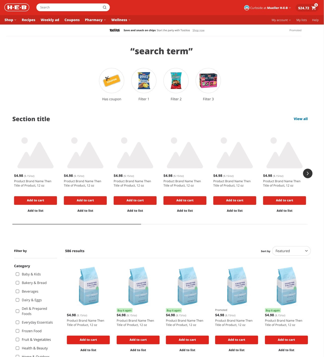
Using customer intent research conducted by the H-E-B research team, we created templates for the search results page that recommend components and strategies based on specificity of a user's search query
Key contributions
Project details
Role
Lead UX content designer
Team
Product design, search engineering, merchandising, product management
Responsibilities
Information architecture, wireframing, testing copy
Opportunity
The HEB research team had just completed a study on customer search intent, looking closely at the different objectives a customer may have when coming to the H-E-B website to search. At the same time, H-E-B's data science team had just run an analysis to group search terms into different intent buckets to better understand customers' shopping missions.
The next phase of the work would be to gain insight into a user's openness to related content based on the specificity of their search term, with the ultimate goal of creating templates based on the discoverability of a search query.
To help us understand the future of the search results page (SRP), we set up a series of user tests where we got customer feedback on design concepts with different layouts to determine the right balance of results and additional content.
Goals
For our users:
Provide relevant, sponsored and merchandised, products and savings within our Search experiences to help them discover more products more easily
Avoid disrupting customers goals (get out of their way!)
For the business:
Increase profitability
Create an experience that can scale to support algorithms and segmentation
Assure we are creating solutions that will work holistically with all our digital experiences
Increase H-E-B Retail Media (ads) inventory in search
My approach
1
Map intents to existing components and ideate new components
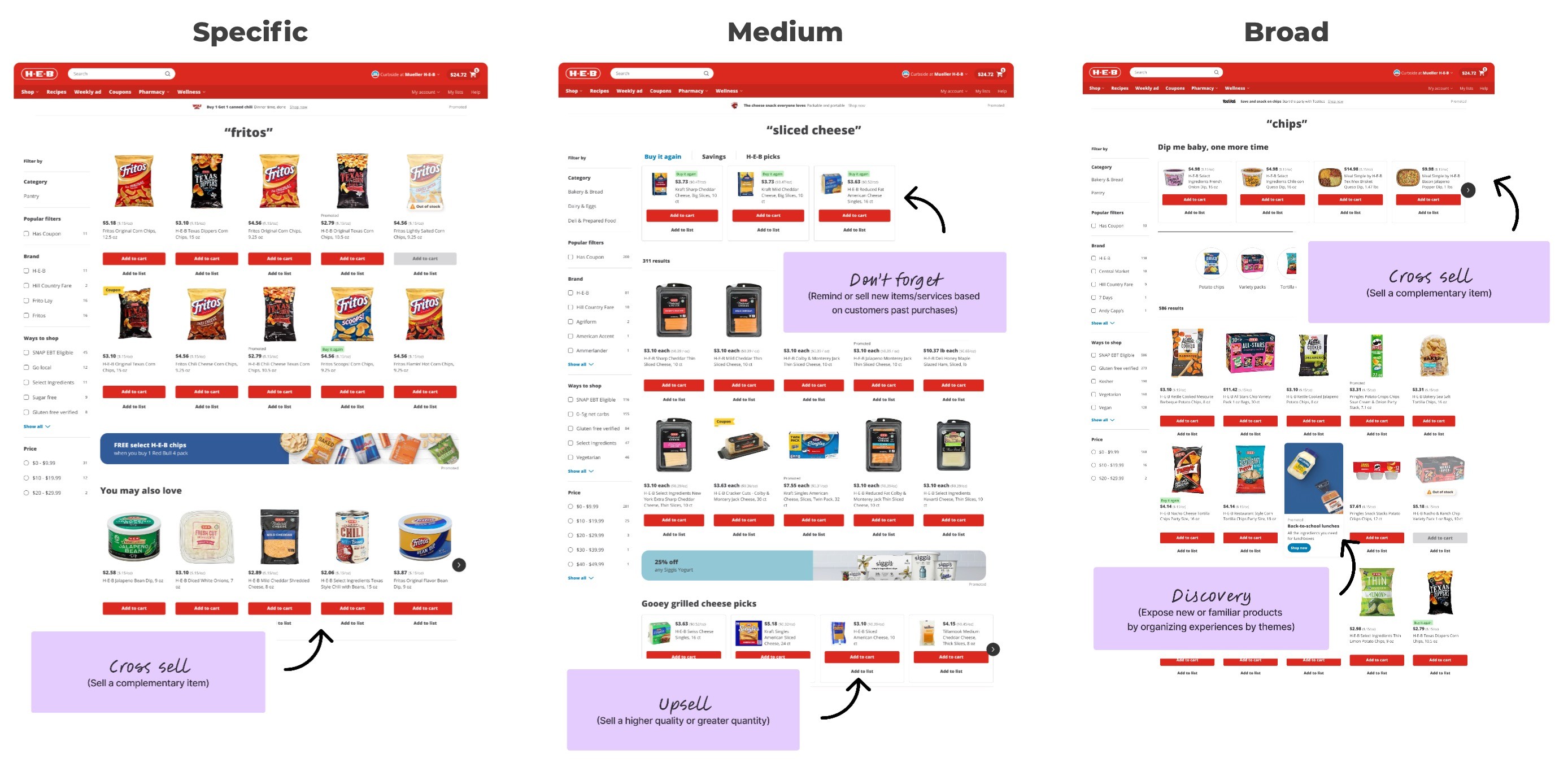
We evaluated our component library for what would work well on the search page (mostly various carousels) and also concepted some new component types that would work well for the selling strategies we wanted to capture. We then identified which components we wanted to test in which specificity intent bucket (specific, medium, or broad search terms). Examples include:
In-grid carousels for cross-selling
Above grid tabbed carousels to group results around user or merchandising needs (Past purchases, Savings, Own Brand highlights)
In-grid ingress points to collections of items of a related theme
We led a series of workshops to incorporate feedback from merchandising, marketing, and retail media stakeholders to refine these strategies.
2
Get the templates in front of users (testing time!)
Before creating the final templates, we wanted to get user feedback and incorporate any insights into the final recommendations. The user test included:
33 participants, both H-E-B customers and those who haven't shopped H-E-B
12 templates (both mobile and web) shown to participants: 3 templates per search term specificity plus current state of search
Our main goal was gauging sentiment on the amount of content on each template (an amount that increased from specific to broad). The test resulted in a neutral-to-positive sentiment about the content, as long as it felt highly relevant to the search term, and didn't impede a user's ability to find their results.
For our stakeholder readout, we divided the key findings into two buckets:
Component insights: feedback on how customers interacted with a specific component type, agnostic of which query type they were observing
Structural insights: feedback on order and volume of components for a specific query type
The slideshow below highlights some of the insights we shared in our research readout with stakeholders:


3
Document template and strategy recommendations for merchandising
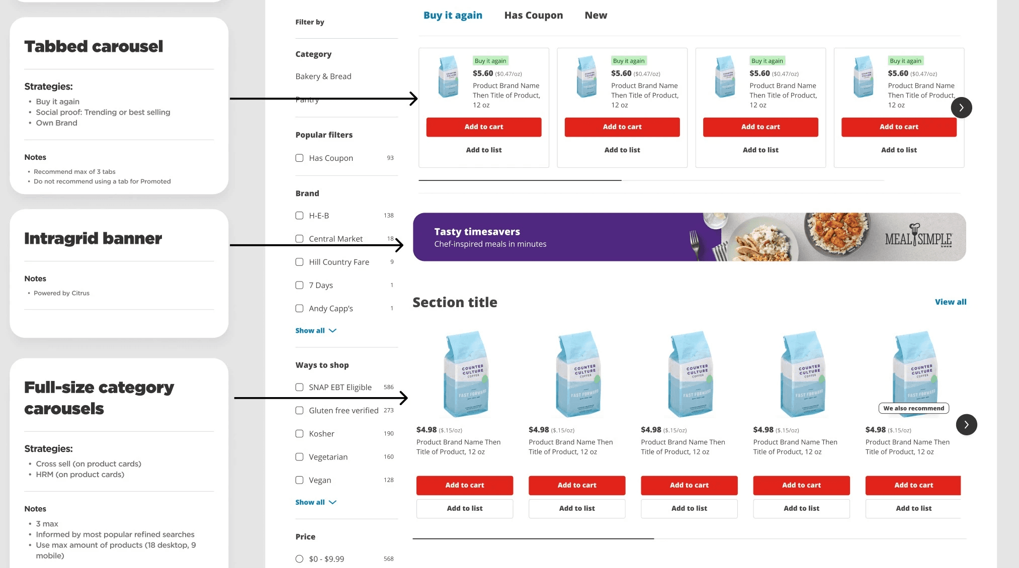
The final deliverable was a Figma file and accompanying Confluence documentation that synthesized final recommendations into three templates, one for each query specificity.
From there, we used testing insights to influence roadmap decisions about what components we'd prioritize building in the future, starting with a carousel above the product grid to support merchandising strategies.

Content decisions
Results, impact & learnings
Not every project leads to an earth-shattering outcome.
After we presented the final templates and passed off documentation to our site builders, not much happened. We built the ability to place a carousel at the top of the search grid, and incorporated a recipe carousel at the bottom of the search results. But since then, there hasn't been a lot of experimentation with new components. This is mostly due to the highly manual nature of these solutions and since then, we've pivoted to exploring solutions driven by personalization, segmentation, and AI-powered algorithms.