Improving customer clarity
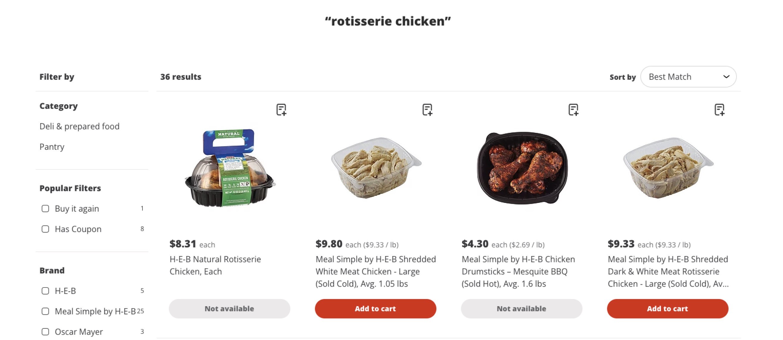
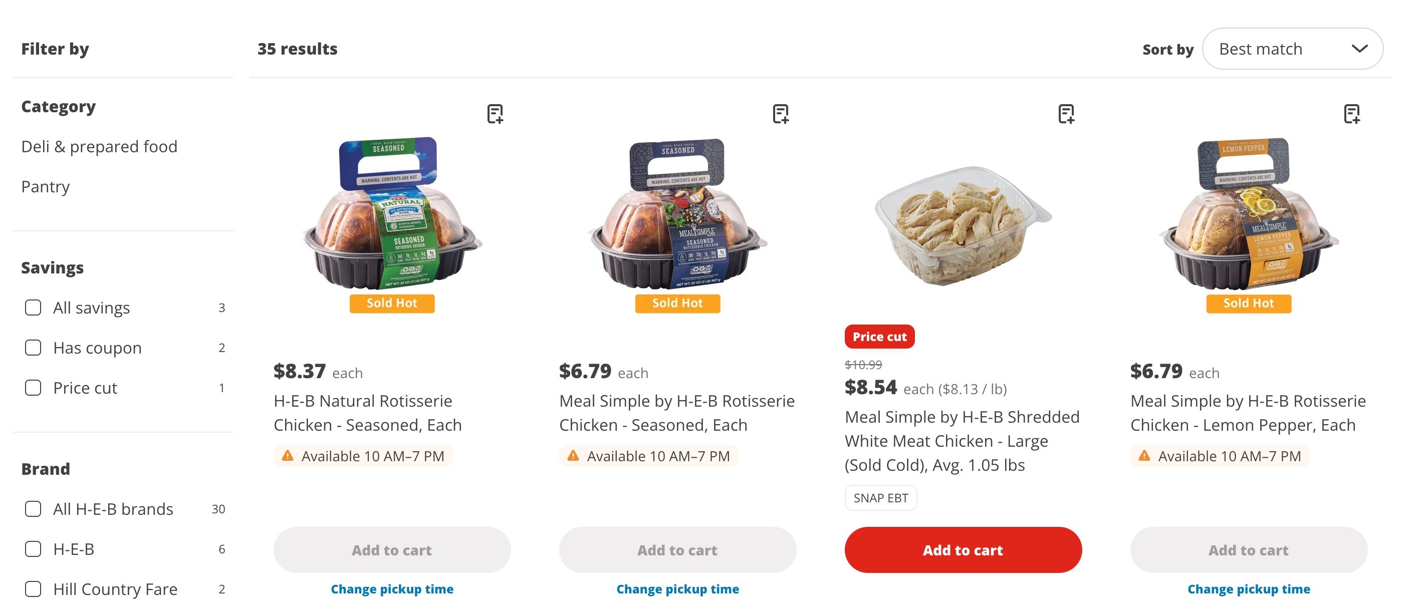


To address a lack of transparency on when products were available, we designed a new flow to show availability across the shopping experience
Key contributions
Project details
Role
Lead UX content designer
Team
Product design, data engineering, site operations, product management
Responsibilities
All copy across product card, product detail page, cart, and checkout flow, copy templates and guideline creation, change management
Opportunity
H-E-B sells hundreds of products online that are only available to order for curbside or delivery during specific time periods—for example, made-in-house rotisserie chickens can only be ordered between 10am and 7pm.
Because customers can add items to their carts before selecting a time slot for delivery or pick up, they could add a rotisserie chicken to their cart, proceed to check out, choose a time slot, and only then would they learn the item isn’t available for the time they chose.
At that point, users were left with few options: remove the items from their cart and proceed with their order at the selected time, or, if they really wanted that rotisserie chicken, select a new time and risk other items being unavailable for that time.


Goals
Improve the visibility of an item’s availability schedule
Alert users of time slot conflicts earlier in their journey
Give users alternate paths when they run into a conflict
Reduce number of "shorts" (item customer orders not included in final order) and "subs" (item customer orders substituted for something else)
My approach
1
Understanding the partner experience
We started by mapping the existing processes in place for internal partners (the site operations team) to manage time-restricted products. We found out:
Site ops' primary tool for product availability management had a highly manual interface, by which they set up rules for individual products (or a category of products) based on times and days of the week
The site ops team was also responsible for writing and inputting a message for each product, leading to worries about QA, length, and clarity
We would only be able to account for the products we knew about during design, so any new products added into the catalogue after launch would need to be managed by site operations—we'd need to create an easy-to-follow system once we wrapped the work
2
Untangling the data that powers the experience
Another roadblock was the data that powered the availability management tool: the system was technically only for blacking out items for online orders.
As an online shopper (for pickup or delivery) you can only order a rotisserie chicken between 10am and 7pm for operational reasons. However, if you were to go in-store at 8pm, there may well still be a chicken there you could buy.
The data available to us to show customers online, regardless of their shopping mode or intent, was the pickup and delivery blackout times. We needed to determine the risk of showing an item’s availability based on pickup/delivery times and whether that would be misleading to customers. After evaluating each product's schedule, we saw that the benefit of seeing those times would outweigh the risk of someone assuming a product wasn't available at all—at best, it would prevent someone from going in-store and finding an item wasn't available, and at worst, that customer might not make the trip.
3
Mapping the content to our components
Once we untangled the data plumbing, we realized that the message generated in the availability management tool was used in multiple places: the product card, the cart conflict sheet (triggered by selecting a time slot that didn't work for items already in your cart), and the cart conflict modal (triggered by adding to cart from the product detail page) with a "conflict" time selected. This presented a challenge for content: what language would make sense in all three spots (that each had their own very different formatting).

4
Testing customer preferences on conflict resolution
The main difference between the two main solutions we were beginning to explore were giving customers the option to resolve time restriction-related conflicts at the product level or at checkout. We developed and executed a usability test using UserTesting.com to gauge customer preference and get additional feedback on how much context users wanted on time restrictions (especially if they didn't have a time slot already selected).
We conducted an unmoderated test where users were guided through three prototypes and then answered a series of questions on ease of use and preference.
User preference was for the experience where the conflict was resolved at checkout—with added visibility into availability along the way—on both the product card and the product detail page.


Users also preferred to change their time directly from the cart conflict sheet.
5
Finalizing the solution
Product card availability message
We created an availability message that would appear on product cards only when a customer selected a time slot in conflict with that product's availability, determining that showing the message at all times would increase cognitive load at a time when the customer’s intent isn’t clear
We also added a secondary CTA, “Choose new pickup time” — this provided users with a path to find a time that would work for them
I developed a set of templates for site operations to work from when creating new messages (see screenshot X).

Product detail page
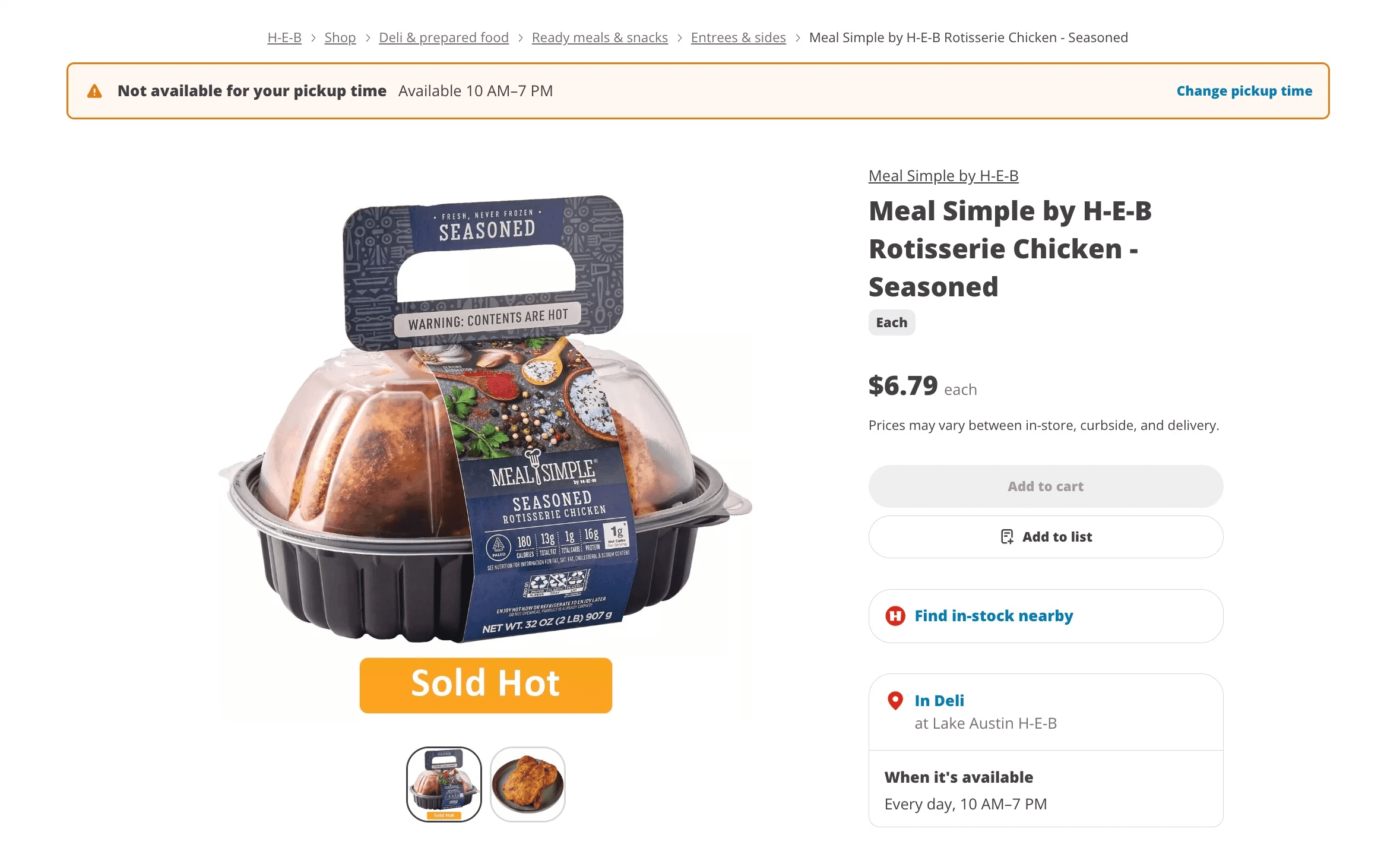
To alleviate friction, we added the availability schedule (When it's available) for users on each individual item’s PDP. Instead of having to rely on site operations partners to manually enter this information, we were able to utilize and transform the availability data into a user-friendly summary. I worked closely with backend on that translation.
We gave the schedule a prominent, dedicated spot on the PDP, knowing from research that users often skip or skim the “Product details” section — I didn’t want this important information buried there.
If a user has a conflicting time slot selected, we included an alert banner at the top of the PDP communicating that they wouldn't be able to add to cart, and giving them an option to change their selected time.
Content decisions
Results, impact & learnings
Fewer cart conflicts at checkout = happier customers.
We saw a 43% drop in users seeing a conflict at checkout for blackout items two months after launch, suggesting that they resolved those conflicts on their own earlier in their journey instead of being surprised with a disappointing "not available" at the end of their shop.
Codifying formatting decisions.
Because I had to dig so deeply into how I wanted to format date and times, it led to some content team-wide conversations about our overall approach to time formatting. We now have more detailed documentation that other content designers can use when they need to show dates and times in the flows their teams are working on.
Laying the ground work for phase 2.
As soon as we wrapped this work, we tackled the other half of this problem—items that become available for more unpredictable reasons, like machinery outages or supply chain issues. We were able to leverage our approach fairly seamlessly, with some tweaks to the language.